The Quiet Power of Beauty
In Japanese art and craft, color is never just for decoration. It holds memory, meaning, and the quiet power to move the heart. Unlike the bold palettes often favored in the West, traditional Japanese aesthetics value subtlety, restraint, and harmony.
The colors known as dentōshoku (traditional Japanese colors) are born from nature, the seasons, and raw materials. These hues do not shout; they whisper—gently inviting us to look closer, to feel deeper.
They reflect a philosophy rooted in coexistence with nature, reverence for materials, and the beauty of impermanence. In traditional crafts, color is more than a surface—it is a glimpse into the way of life itself: mindful, humble, and deeply connected to the natural world.
A Palette Inspired by Nature

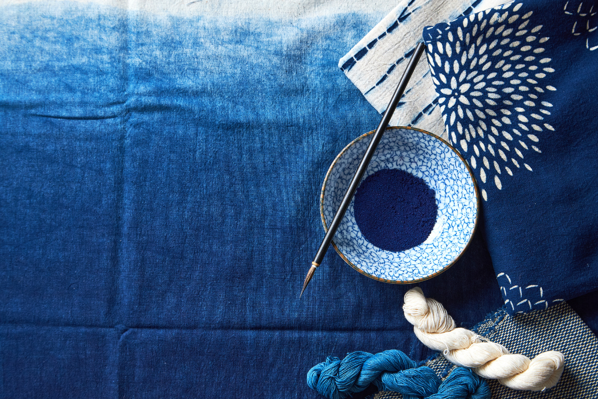
Many traditional colors are drawn from natural dyes and seasonal landscapes. For example, ai (indigo) comes from fermented indigo leaves and is known not only for its deep, calming beauty but also for its practical insect-repellent qualities. In aizome (indigo dyeing), artisans immerse fabric in the dye repeatedly, letting it oxidize in air to develop a layered depth that feels both ancient and alive.

Ruri-iro (lapis lazuli blue) evokes the deep night sky and is often found in Buddhist art, symbolizing purity and cosmic calm. In crafts like cloisonné enamel and ceramics, this color brings a meditative stillness.

Yamabuki-iro (Japanese rose yellow) captures the golden bloom of spring. It has long been associated with prosperity and seasonal transition, appearing in kimono dyeing and decorative crafts.

Beni-iro (deep crimson red), derived from safflower petals, was once so precious it was reserved for court nobles and high-ranking samurai. Used in dyeing fine silk, beni speaks of refinement and status. In crafts like kyo-yuzen dyeing or kumihimo braiding, its rich hue adds a regal touch.

toki-iro (pink like a crested ibis), a pale, warm pink that symbolizes hope and renewal. This color often appears in kyo-ningyo (Kyoto dolls) and hand-painted ceramics, evoking the gentleness of spring and the delicacy of human life.
Each of these colors carries not only aesthetic richness but also emotional and spiritual significance. In Japanese craft, color is never random—it is a quiet dialogue between artisan, material, and spirit.
Living with Color: The Beauty of Japanese Craft

Traditional Japanese colors are not just visual—they are experiential. Rooted in nature and shaped by time, they offer a softness that soothes and harmonizes. These colors are often embedded directly in the materials through techniques that honor the nature of each element.
In Kyoto ceramics, the firing process produces hues that echo dusky skies or early spring mists. In Kyoto Damascene (Kyoto-style inlay work), delicate gold and silver threads catch light in subtle ways, creating an understated brilliance that reflects the tones of nature.
Textile arts like Kyōyūzen and kumihimo rely on natural plant dyes—extracted from indigo, persimmon, and plum bark—to create colors that shift gently with the seasons. These colors take time to develop, requiring multiple layers of dyeing, which results in hues that feel uniquely alive.
In lacquerware, traditional hues such as deep crimson, umber, and black emerge through meticulous layering and polishing. These pieces mature over time, gaining depth and quiet radiance, just like the colors they carry.
What ties all these crafts together is not just technique, but philosophy. The reverence for imperfection, the celebration of transience, and the deep relationship with nature are expressed through every shade.
The Spirituality of Subtle Color

Japanese traditional color is more than visual beauty—it’s spiritual. It reflects the rhythm of nature, the teachings of Zen, and the idea that true richness lies in simplicity.
The aesthetics of wabi-sabi find beauty in what is quiet, aged, or imperfect. In temples and gardens, aged wood, moss-covered stone, and the muted gleam of gold leaf are all part of this living color palette.
Even in everyday life, we find this gentle palette—in the soft gray of handmade paper, the muted earth tones of tea bowls, or the natural black of ink stones. These colors do not dazzle, but instead ask us to slow down, to notice, to feel.
A Gentle Invitation to Experience
In a world that moves so quickly, the quiet presence of traditional Japanese color offers something rare—an opportunity to pause, to reconnect with nature, and to bring depth into our daily lives. These colors, embedded in handcrafted works, serve as gentle reminders of a slower, more intentional way of being.
If you feel drawn to these subtle expressions of beauty, why not explore the handcrafted pieces that carry them?
Each item reflects not only the artisan’s skill but also the philosophy of color that has been cherished in Japan for centuries.
→ Explore our collection of artisan-crafted pieces inspired by traditional Japanese colors
Let these colors become part of your everyday—quiet companions that bring calm, meaning, and timeless elegance to your life.